
.svg)
.svg)
Geoffrey Tory, Champ fleury (1529)

Letter Design with a Hermetic Touch
Geoffrey Tory, Champ fleury (1529)

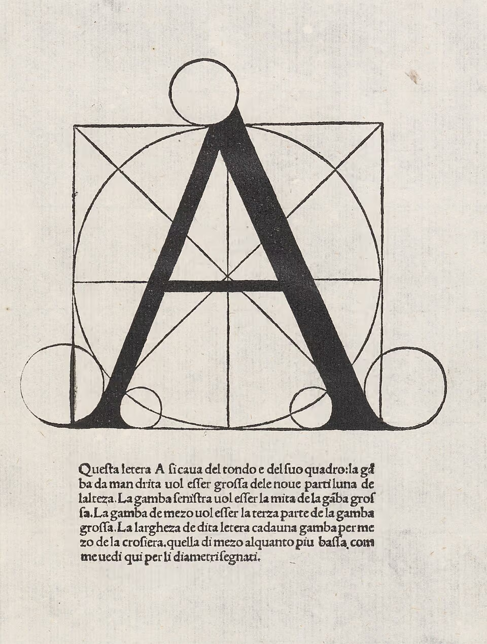
During the Renaissance, several books were published on the subject of “the ideal letter form”. The best known are those by Luca Pacioli, Divina proportione, printed in Venice in 1509, and by Albrecht Dürer, printed in Nuremberg in 1525. In France, Champ fleury, written by the artist, woodcarver and Latinist Geoffrey Tory (1480-1533), was published in 1529.
Tory studied Latin at universities in Paris and Italy. Back in Paris, he was appointed professor and, a year before his death, librarian at the University of Paris (1532).
He also worked in Paris as a bookbinder, editor of texts, and proofreader for the press. Around 1512, Tory's interest turned to the arts, especially Italian painting and engraving. From 1518 onwards, he began regularly producing woodcuts, which were highly valued by book printers. It was during this same period that Tory took up selling books himself.
However, many book historians have sighed deeply when studying Champ fleury: how can you distil useful information for designing a letter from the enormous amount of symbolism, allegory and mythology with which he fills his book? Firstly, it must be said that his book is not intended as a manual for designers of printing type, but for stonemasons and artists such as glassmakers and carpet designers, for example. And actually, the answer is: the book is worthless as a manual, but has nevertheless become world-famous because of the underlying idea and the woodcuts! (A reprint appeared in 1549, in a much smaller format than the original edition, but with the same woodcuts: the illustrations in this article are from the 1549 edition).
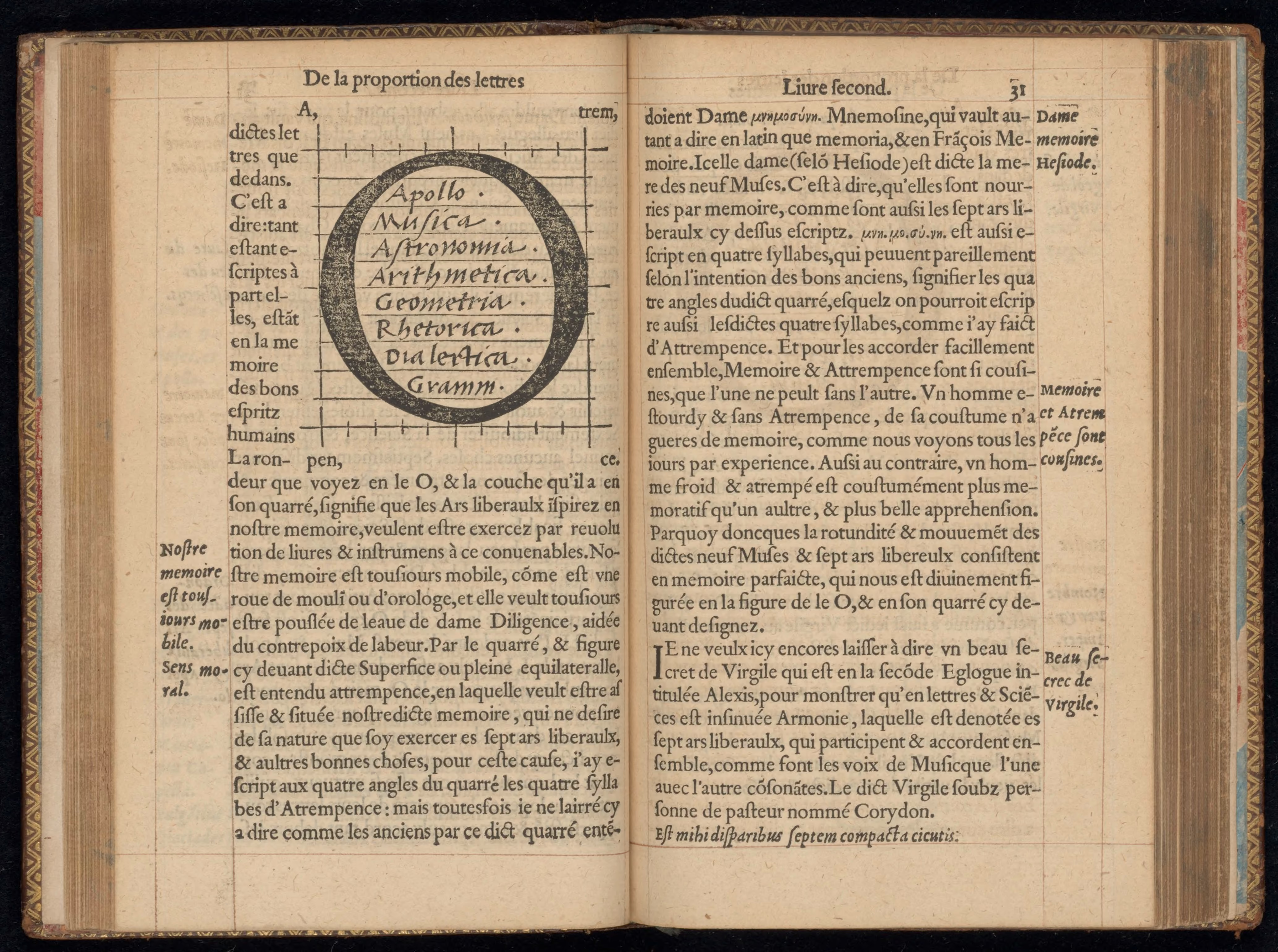
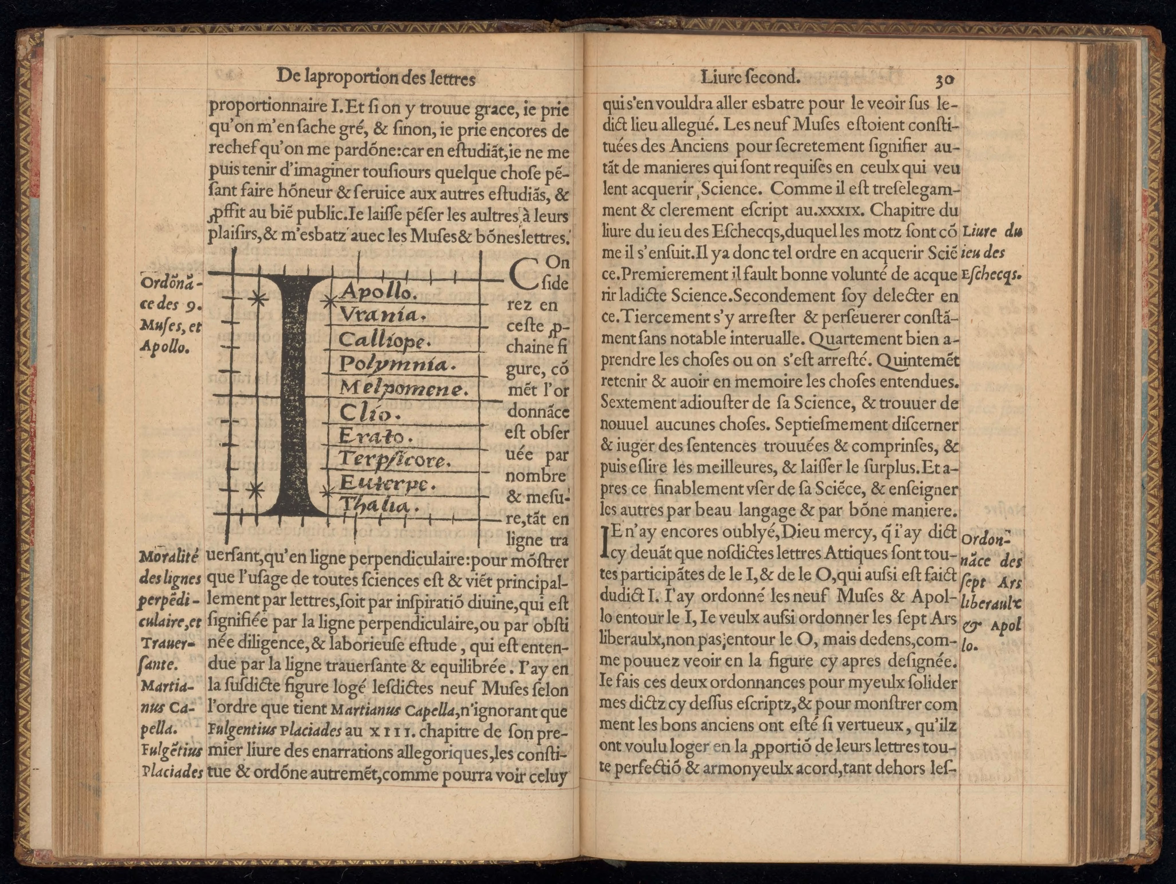
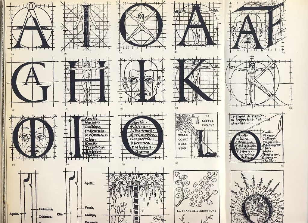
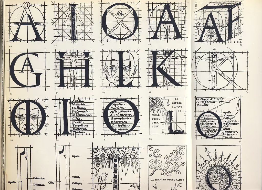
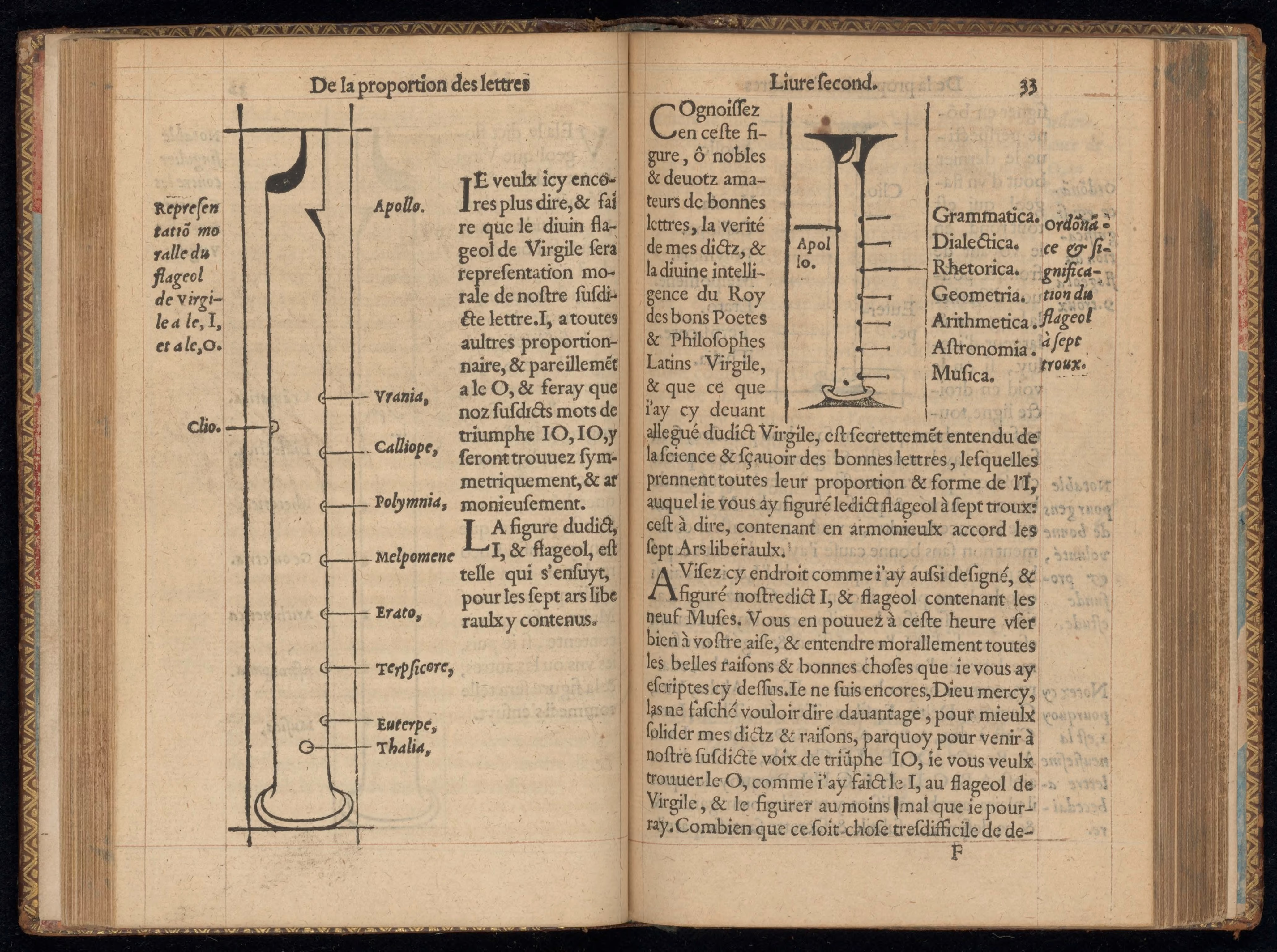
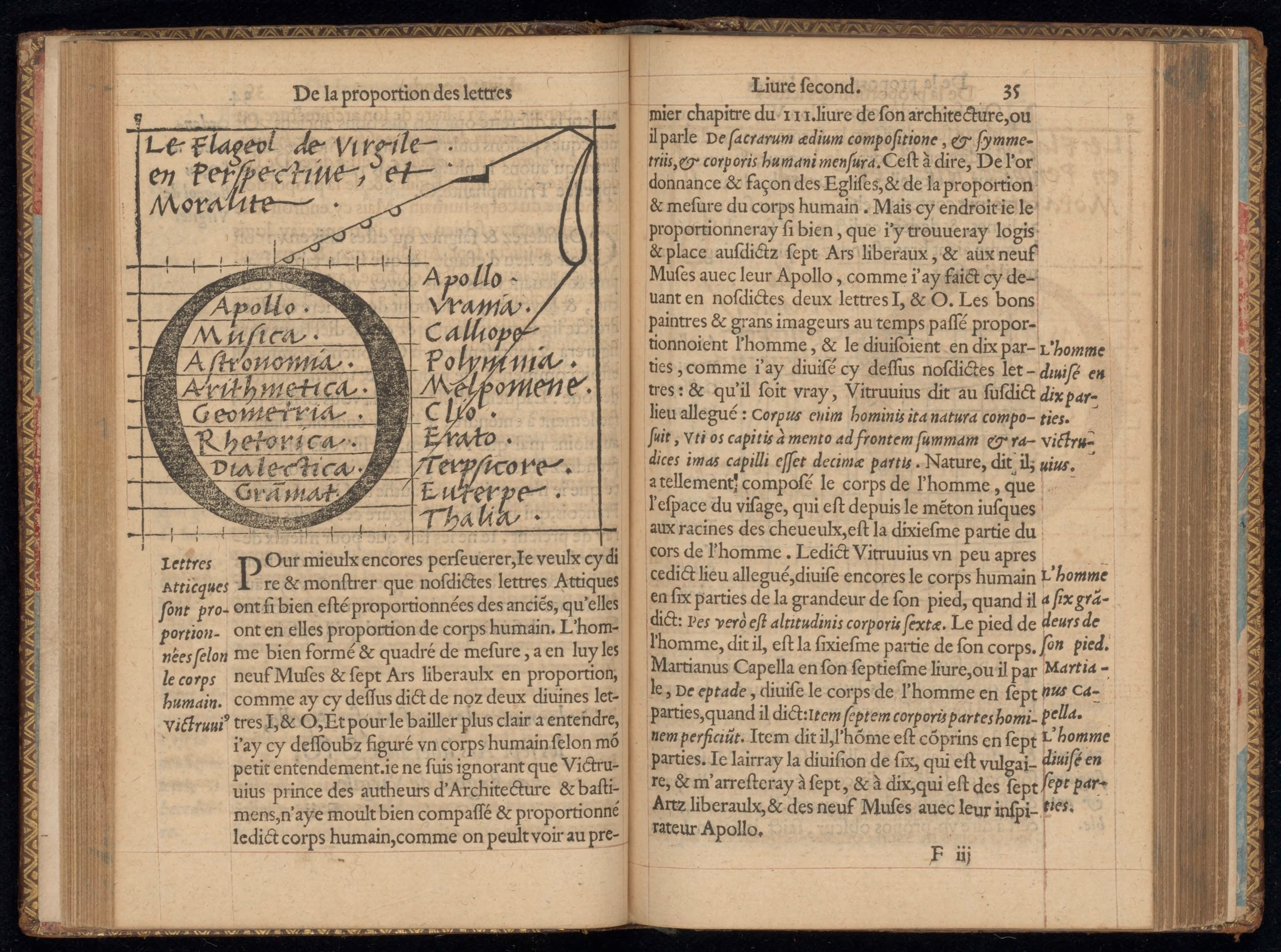
An example of his allegorical approach: he divides the box within which a letter must be designed into ten times ten smaller boxes. He explains the justification for this using the letters I and O. Apollo and the nine Muses (together 10) form the height of the I; Apollo and the seven Liberal Arts within the O (figures 1 and 2). After all, all wisdom and knowledge is revealed through letters. The O also symbolises memory. He can illustrate his idea even better using the flute from Virgil's Eclogae (fig. 3), which contains both the I (seen from the side) and the O (seen from below), with a muse at each finger opening. It was the medieval scholar Martianus Capella who linked the Muses to the Pythagorean concept of the harmony of the spheres. The eight spheres between heaven and earth are each populated by a Muse (the ninth, Thalia, belongs to the earth), each of which produces a tone from the “music of the world”. Apollo symbolises the “chord” evoked by all the individual tones. It is clear that Tory was aware of this theory.
His myths and analogies are linked to a world view that is strongly influenced by Pythagorean and Platonic ideas. The teachings of Pythagoras are known as those of universal harmony: there is a balanced relationship between all parts of the universe: everything is created according to measure, number and weight, and geometry is the key to the universe. The mathematician strives to uncover the underlying structure of creation and can thus approach eternal, divine truths. This notion permeated Western philosophy and science until the 17th century, and it was certainly one of the most important components of Renaissance thought as developed in Florence. We encounter it, for example, in Pico della Mirandola's famous 900 propositions: I quote here John Dee, who quotes Pico's words in his preface to Euclid (The Elements, 1570): “By numbers, a way is had to searching out, and understandyng of every thyng”. This approach was also applied in aesthetics: a work of art had to reveal the divine plan, allowing the viewer to discover “touches of sweet harmony”, as Shakespeare put it.
A second example shows once again how Tory reasoned from this world view. When he compares the proportions of the letters with those of the human body, he undoubtedly had Vitruvius' illustrations in mind for the body and Dürer's for the letters. Images of a human figure within a square and a circle were not new, but Tory is the first to project a letter into this composition (fig. 4).
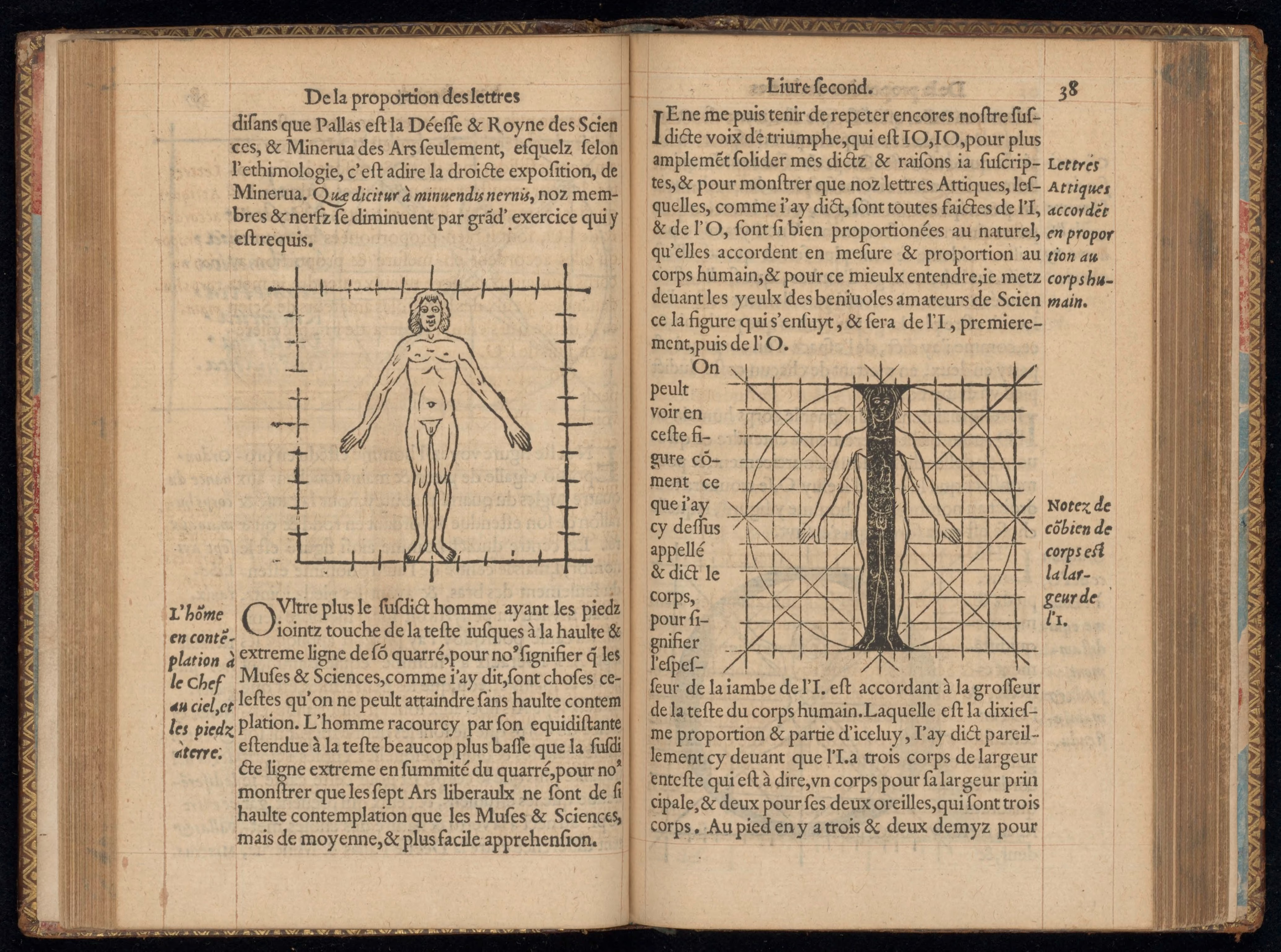
In Pythagorean thought, the circle represents the world of ideas, the infinite, or God. The square symbolises the material world of the four elements; together they represent the totality of the spiritual and physical world. In the head and face, Tory again finds the I and the O: the O is the circle – the most ideal form. The head is round and houses the imagination and reason. Ears, eyes, nose (nostrils) and mouth, seven in number, correspond to the seven Liberal Arts. The alphabet, which has 23 letters (i and j were still one letter at the time), refers to 23 parts of the human body, including the intestines, to which the seven Liberal Arts, the nine Muses, the four cardinal virtues and the three Graces are linked.
The background to this analogy is the idea of man as a microcosm and that knowledge of the microcosm leads to knowledge of the macrocosm and ultimately to God.
The message conveyed by Tory's book is the mystical concept of the correspondence between letters, man and the cosmos. Tory belongs to the milieu of Hermeticists and Christian Kabbalists. In turn, he became a source from which Hermetic authors drew inspiration, for example John Dee for his Monas hieroglyphica, 1564, and the Dutch alchemist/Hermetic philosopher Barend Coenders van Helpen (in Escalier des sages, 1689).

Written by
José Bouman
Drs José Bouman has been head curator of the Bibliotheca Philosophica Hermetica since 1983. She has shaped every museum exhibition since and specialises in Dutch medieval literature.

.avif)